Comprehensive Guide to Flexbox Layout
Explore the core concepts and key properties of Flexbox to master modern web layout techniques with ease.
A Complete Guide to Flexbox Layout
Recently, I've seen a lot of discussions about layout. Some use percentage-based adaptability, some use Table layout, and others use media queries. There are various methods, each of which can be discussed at length. However, programmers, especially those in front-end development, tend to get bored easily; therefore, I am going to explain the Flexbox layout mode in a very, very, very detailed manner.
The Flexbox Layout mode aims to facilitate and enhance layout efficiency. A long time ago, when I first encountered this model, I was deeply fascinated by it.
Flexbox Related Terms
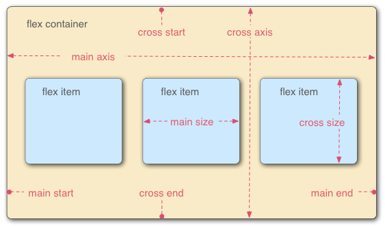
( Image source: https://developer.mozilla.org/en-US/docs/Web/Guide/CSS/Flexible_boxes )
Thanks to MDN, the relevant terms of Flexbox are labeled clearly enough here, so I won't introduce each of them one by one.
Flexbox Details
Before we perform a Flexbox layout, we need to clarify one point: Flexbox should not be understood as a simple property. It has a complete structure: a container and items. All items are arranged based on the container. The container is like a large house, and the items are like furniture inside the house; all the furniture is laid out in relation to the house, and generally, this furniture is inside the house.
Container
display
Now let’s build a house (the container for Flexbox layout). This step is straightforward; you just need to define it using display.
.container{
    display: flex; /* or inline-flex */
}
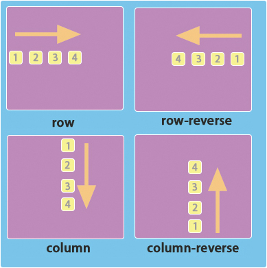
flex-direction
Once we have the house, we can start placing furniture inside it. Suppose our furniture must be arranged in order (put furniture 1 first, then furniture 2, etc.), then as the owner of the house, I can choose the direction of furniture placement based on my preferences (horizontal arrangement, vertical arrangement, forward order, reverse order). At this point, we will use flex-direction.
.container{
    flex-direction: row | row-reverse | column | column-reverse;
}
flex-direction has the following available values:
flex-direction:
- row : Default direction, horizontal arrangement from left to right
- row-reverse : Horizontal arrangement from right to left
- column : Vertical arrangement from top to bottom
- column-reverse : Vertical arrangement from bottom to top
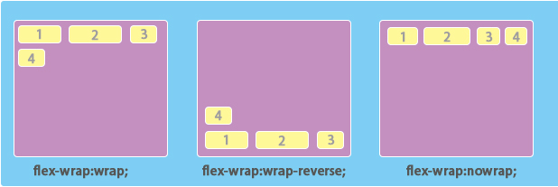
flex-wrap
When we arrange all the furniture in a row, we suddenly realize there are two pieces of furniture without a place to go. What to do? At this point, flex-wrap comes in handy. It specifies how to handle excess elements in a single row. It has the following properties:
.container{
    flex-wrap: nowrap | wrap | wrap-reverse;
}
flex-wrap:
- nowrap : No line break
- wrap : Wrap to the next line normally
- wrap-reverse : Wrap to the previous line
Let’s discuss flex-wrap: wrap. This is easy to understand; when the row doesn't fit, I can wrap to a new line to place my "furniture".
Now about flex-wrap: wrap-reverse: it literally means reverse wrapping, but what does reverse mean? Through experimentation, it's easy to find out that it only reverses the cross axis while the main axis remains unchanged (if you don't know what cross axis and main axis are, please take another look at the term introduction image above); this point is surprisingly notable and needs special attention.
Lastly, let’s discuss flex-wrap: nowrap. If the "furniture" just fits in one row, it's easy to understand. But what if it doesn't fit in one row? If you place all the components against the wall and find that three pieces of furniture cannot fit, but they must be placed in one row, what would you do? Kill me? Maybe! But the machine won't kill us; they will opt for a compromise solution, shrinking all elements' width in proportion to fit all items. Does that sound inhumane?
flex-flow
Programmers are lazy, hence they invented shorthand. Having introduced flex-direction and flex-wrap, if I want to specify the direction and wrapping at the same time, wouldn't I have to write two lines?
.container{
    flex-direction: row;
    flex-wrap: nowrap;
}
No! No! No! We have a much simpler way to write this.
.container{
    flex-flow: row nowrap;
}
Indeed! flex-flow exists for this very scenario!
.container{
    flex-flow: <‘flex-direction’> || <‘flex-wrap’>
}
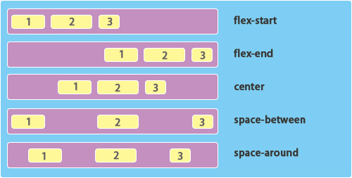
justify-content
Now that we've handled the extreme cases, let's consider a more relaxed situation. If I don't have enough furniture to fill a row and I want them to look aesthetically pleasing, I can modify their alignment to achieve this:
.container {
  justify-content: flex-start | flex-end | center | space-between | space-around;
}
justify-content:
-flex-start: Aligns to main start
-flex-end: Aligns to main end
-center: Centers the alignment
-space-between: Both ends stick to main start and main end, evenly distributing in between
-space-around: Evenly distributing around
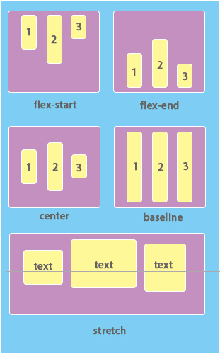
align-items
In the vertical direction, we use align-items to handle it.
.container {
  align-items: flex-start | flex-end | center | baseline | stretch;
}
align-items:
-flex-start: Aligns to cross-start
-flex-end: Aligns to cross-end
-center: Centers alignment
-baseline: Aligns to the baseline of the text
-stretch: Stretches automatically
Items
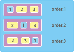
order
By default, flex items are ordered according to the code’s sequence. We can use order to change their order without altering the code.
.item {
  order: <integer>;
}
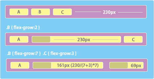
flex-grow
This property is quite special; ‘grow’ means to expand, meaning when all my elements are in a row, how to allocate the remaining space.
.item {
  flex-grow: <number>; /* default 0 */
}
The grow value here can be understood as the share of the remaining space. For example, if the remaining space is 230px, and one item has a grow of 7 and another has a grow of 3, then the remaining space is divided into 10 parts (7+3), each part having a width of 23px (230/10). The first grow occupies 7 parts, which is 161px (7*23), while the other occupies 69px (3*23).
flex-shrink
Shrink ratio, which is the opposite of flex-grow. If the container cannot hold the specified items, it will proportionally reduce each item’s width to fit as many items as possible. For instance, if the container's width is 100px, and it contains two items each with a width of 100px, then if you specify no wrapping, the browser will automatically reduce both items’ widths proportionally, making each width 50px, allowing both items to fit. However, in a case where items A and B are present, and A says: “I'm better than B, I refuse to shrink the same space as B; I will only shrink half of B's space!”, we will use flex-shrink.
.A { flex:1 1 100px;  }
.B { flex:1 2 100px; }
/* flex: 1 1 100px is shorthand for flex-grow: 1, flex-shrink: 1, flex-basis: 20em */
Thus the widths of containers A and B will respectively be 67px and 33px.
flex-basis
Specifies the initial width of the item, i.e., main size, on which flex-grow and flex-shrink are calculated.
.item {
  flex-basis: <length> | auto; /* default auto */
}
flex
As mentioned earlier, flex is shorthand for flex-grow, flex-shrink, and flex-basis.
.item {
  flex: none | [ <'flex-grow'> <'flex-shrink'>? || <'flex-basis'> ]
}
align-self
This has a similar effect as align-items (as mentioned above), except it applies to a single item, not all items.
.item {
  align-self: auto | flex-start | flex-end | center | baseline | stretch;
}
Comprehensive Application
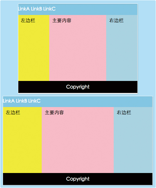
Alright, let’s look at a simple demo showing an adaptive width layout model implemented with flex.
References
Keep Reading
Writing about Finland, life, and code. The next post goes straight to your inbox, without the noise.
Your feedback will help me write better posts—looking forward to it!