Understanding CSS position: sticky
Achieve sticky layouts with just two lines of CSS—learn how sticky elements behave inside their containers for modern UI design.
For "veteran front-end developers," achieving an effect where certain content (such as navigation, table of contents, etc.) remains fixed in the display as the webpage scrolls to a certain height might initially suggest the use of JavaScript to listen to scroll events and then modify the corresponding element's CSS or style to achieve this.
For example, the nav module in the following example:

1. How is it achieved with modern CSS?
I had to add the word "modern" in the title of this section because if you were to ask a front-end developer active before 2019 or 2020 the following question: What are the position properties in CSS? You would most likely hear: static, relative, absolute, fixed, inherit, as these are classic must-knows and possibly essential interview questions for CSS. In reality, position also includes a value sticky. By using this value, we can achieve the aforementioned effect with just two simple lines of CSS:
position: sticky; top: 0px;2. Understanding sticky
Although sticky is useful, it is not as straightforward to understand as fixed or absolute. If you search online, you might find a bunch of conditions for its use, such as "the parent element cannot have overflow:hidden or overflow:auto properties", "the parent element's height cannot be lower than that of the sticky element", and so on.
In reality, we do not need to specifically remember these peculiar rules, as long as we understand two concepts: sticky item and sticky container. A sticky item refers to an element that has been set to position: sticky, and a sticky container refers to this element's parent element. For example, in the image below, after we set .nav to position: sticky, its parent element (the element with the grey dotted border) automatically becomes a sticky container.
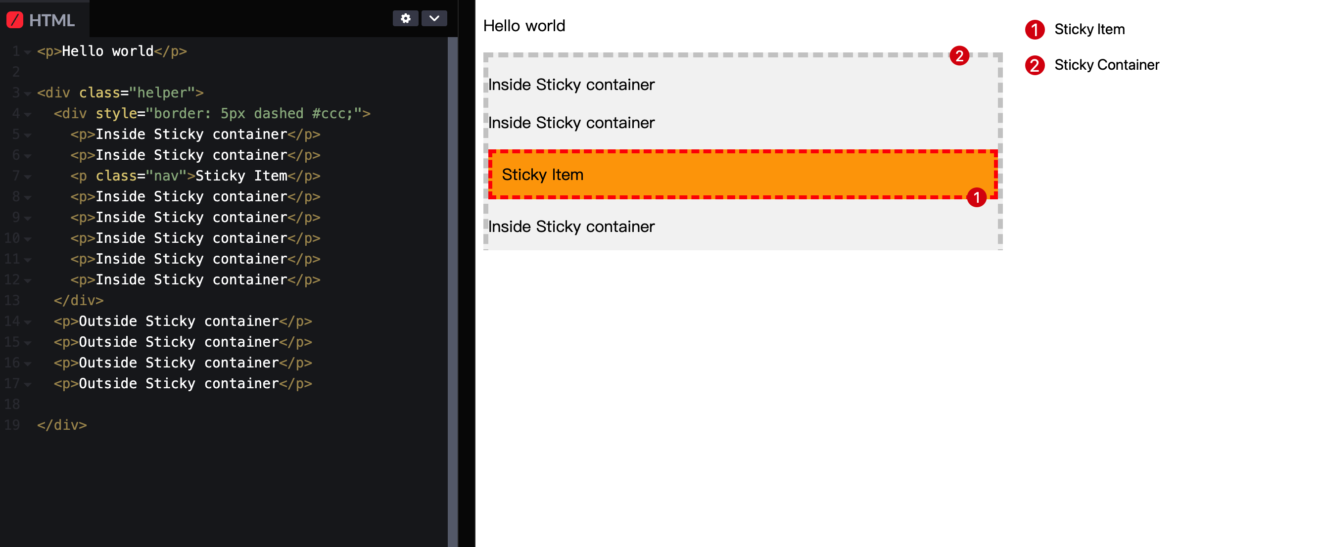
Then, we only need to remember one rule: when the sticky container scrolls, the sticky item will be fixed as soon as it reaches the conditions we defined relative to the sticky container's visible area. If the remaining space in the sticky container is insufficient to accommodate the sticky item, the sticky item will revert to its normal state.
Specifically (see the demo at the end of the article):
- In the case of our demo, we set
top: 50px;. Initially, thesticky itemis more than 50px away from the top visible area of thesticky container, so it moves with the page scroll
- As we continue to scroll, when the
sticky itemis less than 50px away from the top visible area of thesticky container(and thesticky containercan accommodate thesticky item), thesticky itemwill be fixed in the page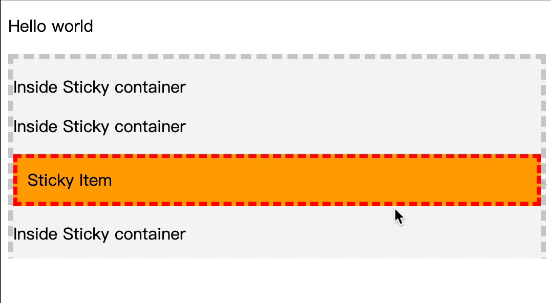
- When the visible area of the
sticky containercannot accommodate thesticky item, thesticky itemwill return to its normal state and move with the page scroll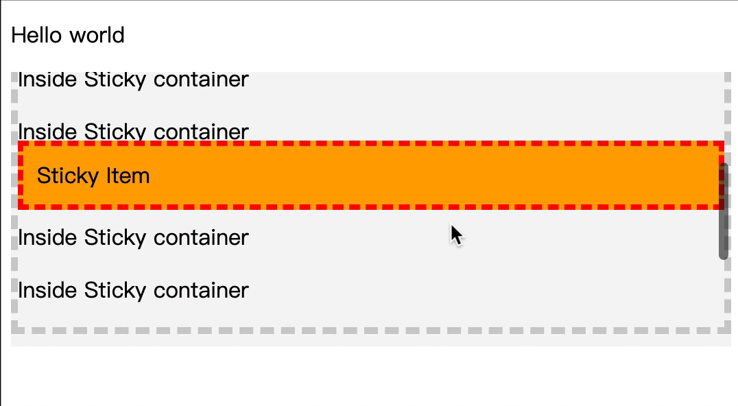
Try the Demo (codepen.io link):
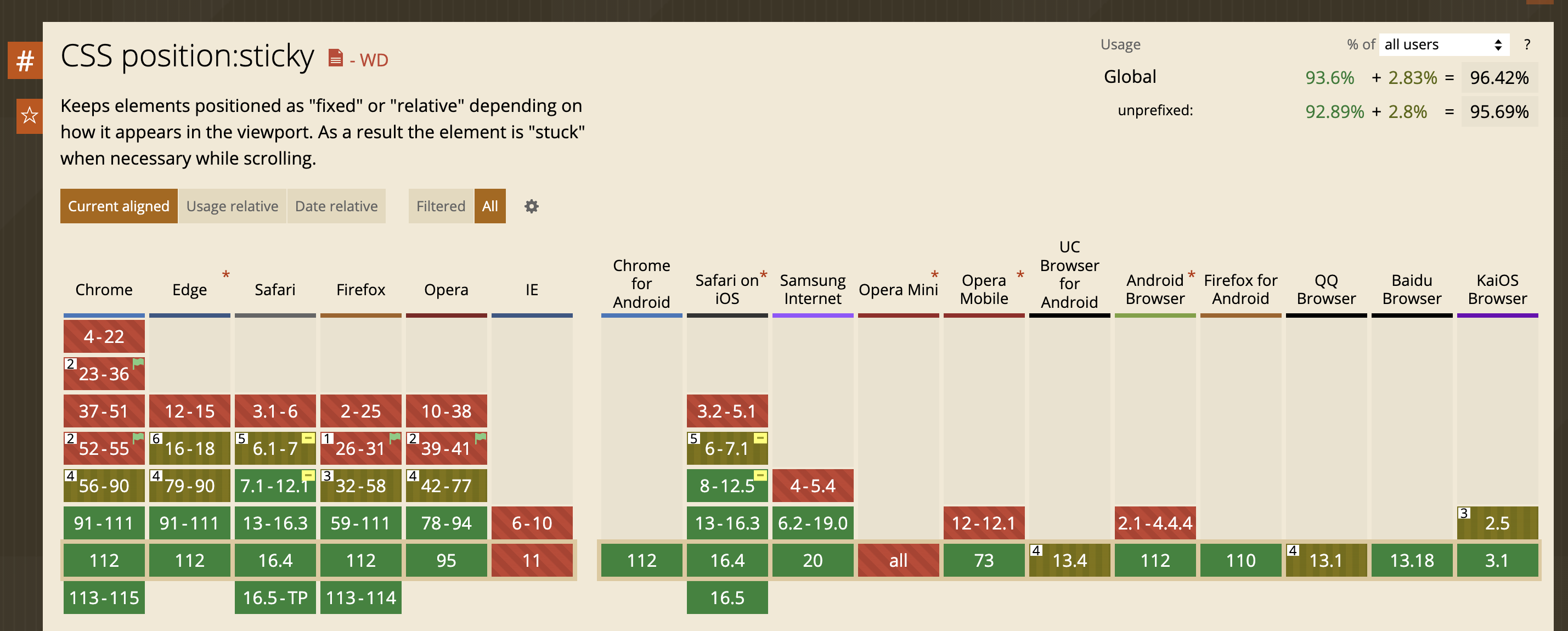
Compatibility
Over the years, apart from older versions of Internet Explorer, all major modern browsers support sticky.
Keep Reading
Writing about Finland, life, and code. The next post goes straight to your inbox, without the noise.
This post is just my perspective—your input will make it richer!